Charting I – Professional charts, made easy
图表一:专业图表轻松做
A few posts ago when I described the work we did in the area of “great looking documents”, I mentioned charting. I am going to spend the next week or two covering charting in detail. For this first two posts, I want to cover how we have used the ribbon to make it possible, with no more than 3-4 clicks, to create a wide variety of professional-looking charts.
我在以前的几个贴子中描述“精美的文档”时提到过图表。在最近一到二周将详细介绍Excel2007图表。在一开始的二个贴子中,将讲述如何只用3-4步,轻松创建精美的专业图表。
When talking to customers about charting in Excel, one of the big pieces of feedback we hear is how hard it is to make a chart that looks ready to publish. Generally, users aren’t graphic designers or experts in information visualization, yet they still want a result that looks professional and communicates their information effectively. With advent of the ribbon, we have a new UI design approach – results-oriented design (which is discussed in a blog post here). In a nutshell, the idea is to give users a couple of reasonable choices for professional designs, then allow them to mix and match those choices into a professional document. While we’ll still give users access to the detailed features that make their documents look good, they should be able to get close to a final result in just a few clicks. To that end, chart creation in Office 2007 can be as simple as making four straightforward choices that give users access to a vast range of possibilities. The four choices are: what type of chart they want, how they want the elements on that chart laid out, how they want their chart formatted, and what document theme they would like to use. I’ll talk about two of these choices in this post, and the other two choices in the next post.
用户在使用Excel图表时,首要的问题是利用现成的模板来创建图表。一般,用户不是专业的图形设计师,他们只想得到一个能展示其数据效果的专业图表。在Exce2007中,有一个全新的预览效果向导的用户界面。总之,这项目设计是为用户提供一系列的选择来完成专业设计的工作,然后通过组合和调整创建专业图表。我们将详细介绍这些功能来创建精美的图表,使用户能通过几次点击便能完成图表。在Exce2007中通过简单的四个步骤创建图表,从而引导新用户入门。这四步是:选择图表类型,选择图表版式,设置图表样式,设置文档主题。在本贴我将介绍前面二步,其余二步在下一贴介绍。
Chart Types
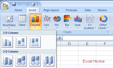
In current versions of Excel, when a user creates a chart, the first thing they need to do is select the type of chart – column, line, scatter, pie, surface, and etc. In Excel 2007, we’ve made the variety of chart types available a lot more visible, and we have offered help for users to choose between them. To insert a chart, a user would start with the Insert tab. Excel 2007 has an insert chart type “group” (7 related controls) on the ribbon’s insert tab. This makes it easy to pick a chart type, with large icons and tooltips that describe when to use a particular type.
图表类型
在当前版本中创建一个图表,第一步就是要选择图表类型:柱形图、折线图、散点图、饼图、曲面图等等。在Excel 2007中,有更多的图表类型以供选择。以下演示如何选择图表类型:在插入图表栏中插入一个图表,Excel 2007的插入菜单中有个插入图表栏(共七种图表类型)。利用大图标和细分图表类型的工具提示,可以非常容易地选择所需的图表类型。

(Click to enlarge)
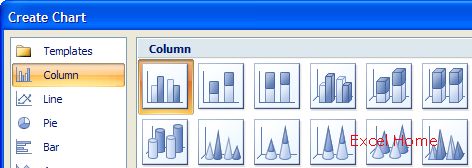
Note that we have provided galleries for the most common chart types – column, line, pie, bar, area, and scatter – with the remaining chart types surfaced in a 7th gallery. For those who want to browse through the full list of chart types, or change the type of an existing chart, the Create Chart dialog makes it easier to explore the list of chart types and pick the one you want.
Excel 2007除了提供最常见的图表种类:柱形图、折线图、饼图、条形图、面积图、散点图等,其余图表种类全部放在其它图表栏中。如果要浏览全部图表类型,或改变已有图表的种类,打开创建图表对话框可以容易地浏览和选择图表类型。

(Click to enlarge)
And for those who love shortcut keys, Alt+F1 will now create a chart object with the default chart type, while F11 still creates a chart sheet with the default chart type.
快捷键:Alt+F1在当前工作表中创建默认图表类型的图表对象;F11新建默认图表类型的图表对象
上一篇:excel表格制作:Excel自动醒目的小计 下一篇:excel表格制作教程:题外话 #2:轻松设置货币符号
郑重声明:本文版权归原作者所有,转载文章仅为传播更多信息之目的,如作者信息标记有误,请第一时间联系我们修改或删除,多谢。
